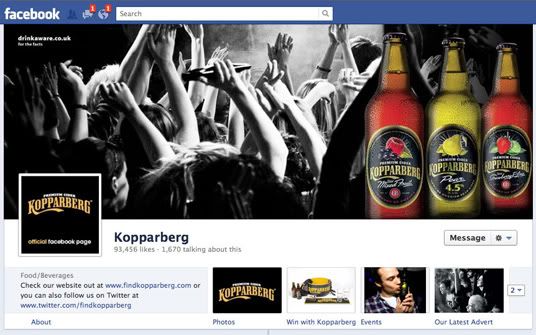
Just as we were all getting used to the last Facebook overhaul of our Newsfeed and Ticker, now they go and spring the new look Brand pages on us! All fan pages will automatically update to the new layout on 30th March 2012, but all brands can opt to change before then. The layout is very much like the personal Timeline profile pages I explained in my 'Time for Timeline' post a couple of weeks ago. If you're still resisting Timeline then maybe now is the time to upgrade your own page too - read more at www.facebook.com/about/timeline.
We've not updated the PrizeFinder page yet as it needs a bit of behind-the-scenes work to get it all nice and shiny for you - but I have updated my SuperLucky page if you want to check out the difference. Other UK pages that have already updated to the new layout are Hot Pants, Sky, Koppaberg and The Co-operative Food - but I'm sure you'll see plenty of them updating today and tomorrow!
Here's a rundown of the important changes that affect compers:
Non-linear layout of wall posts and information
This is the main drawback of the new format if you're a comper. On the old style pages, it's easy to scroll through a single list of wall posts and see several of them on your screen at once. With the new format, the posts zig-zag across the page and photos appear HUGE. If you're looking for a particular post it's incredibly hard to find things… In addition, Facebook highlights at the top right of the page a random update where your friend has mentioned that page - which could be from years ago, and can be very confusing!
New way of displaying Apps/Tabs
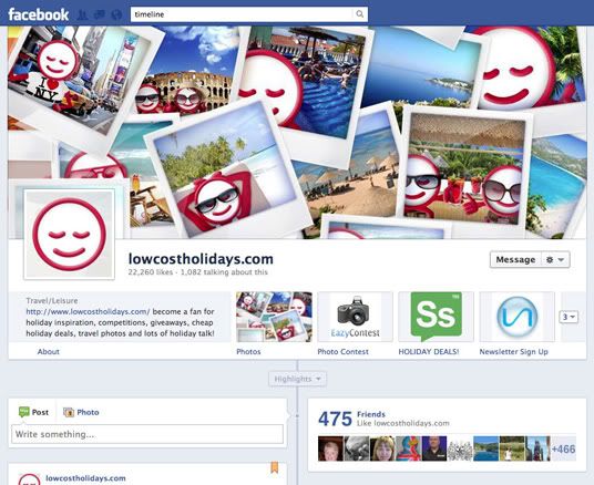
The new format no longer has a list of links on the left hand side, where previously you would find the competition tabs. Apps will now appear as boxes sitting underneath the big cover photo – but only three of these are visible (Photos are also there by default). To see more, users must expand the panel by clicking the arrow to the right of the boxes - this means, unless the company have highlighted the App as one of the 3 main ones, it's not as easy to spot a competition when you first arrive on a page!
No more 'Landing pages'
The new format means that brands can't add a 'Landing page' with details of their latest comp, asking you to Like the page to enter. Instead, Facebook wants them to promote their comps by paying for ads! Not all brands will want to do that though, so as compers we'll have to be on the ball and keeping our eye out for wall posts with links to the competition Apps.
A 'pinned' message at the top of the Timeline
Brands have the opportunity to 'pin
' an important post to the top of their Timeline for up to seven days - this is where you should be looking for details of a new comp! A pinned post has a little yellow ribbon on it - see SuperLucky for an example.
Pages and fans can now message each other directly
By default Facebook adds a 'Message' button on the right of the new fan page design (see the screenshot below from the lowcostholidays.com page) - fans can click this and send a message to the Page Administrator. I imagine some big brands will disable this function, but in many cases it's much better to send a company a private message about an issue rather than leave a public wall post - particularly if you're complaining about something! I've read that pages can also send fans a private message rather than responding on a wall post but that doesn't seem to have been rolled out yet.
You don't need to LIKE pages any more to get their updates
Click the cog on the right of the brand page and there's a new option 'Add to Interest lists' - create a 'comps' list, add pages to it and you can choose to view posts from all your favourite pages in a separate Newsfeed (and you don't even need to LIKE the pages to add them to your list!). Note: I used this feature last night, but yet today it's disappeared so I suspect there may be a temporary glitch with it…
And that's a quick introduction to the new brand pages - so what do you think of them?


